| |||
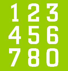
In 2000 Nike introduced custom made shirt numbers for teams playing in the Nike kit during the European Championship Football and during national and international competitions in the following seasons. The individual figures were made out of lines with rounded beginnings and endings, just as in typefaces like VAG Rounded, Futura Round Headline, Arial Rounded and Frankfurter. But they were no straight copies of one of these typefaces; they were adapted to fit the football shirt. Especially the 4 was given a surgical operation: the little horizontal bar that stands out on the right was chopped off. I think this operation was executed because this figure was too wide, causing problems when two figures have to be used, e.g. in the number 24 (see also: measures). When, in 2002, the World Championship Football was organised in Japan and South Korea Nike introduced a new range of numbers for the teams playing in their shirts, e.g. South Korea, Portugal, Brazil, Argentina and Belgium. The rounded numbers were left behind and replaced by rather tall numbers, constructed from rectangles with rounded corners. A comparable typeface is hard to find, but this type style is also seen in typefaces like Berthold City or Eurostile. The width/height ratio of the 2002 Nike numbers is smaller than that of the preceding 'sausages', so they could be used with a bigger height without becoming too wide to fit the shirt. The stroke width is well chosen for a good legibility on plain shirts. The main disadvantage of these numbers is that they are based on a geometric construction, so 3, 5, 6, 8 and 9 can easily be confused (see: construction). The most curious figure is the 1, which looks like a walking stick or periscope. And to be honest, these figures also look like a snack, in this case the typical Dutch 'frikadel'. In 2004, Portugal was the host of the European Championship. Teams playing in the Nike kit again got new shirt numbers. It is an original design, probably inspired by the typeface DIN Engschrift. As in the 2002 Nike numbers the 1 is the most remarkable figure. In contrast with the 1 from DIN Engschrift this is a straightforward rectangle without a cross bar on the top. I think the idea was to make it clealry different from the 7. The drawback is that it now looks as a capital I or a lowercase l. And the number 11 looks like a rotated = sign. Furthermore, the 7 has a strange curve in the diagonal. Although the stroke width is rather heavy, these numbers are an improvement compared to the preceding ones. In the mean time they still don't breath the spirit of a dynamic football team. | ||||||
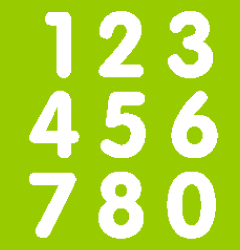 | ||||||
Figures from VAG Rounded. | ||||||
 | ||||||
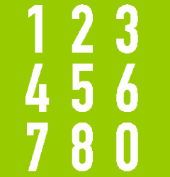
Figures from Berthold City. | ||||||
 | ||||||
