| |||
Introduction | For many, many years the team of Schalke 04 (Gelsenkirchen, Germany) uses the same typeface for numbers and names on its shirts. The typeface is –not exactly, but very close to– ITC Kabel Ultra. It's too fat and I don't like the heavily curled 2 (see also: Bauhaus and Blippo), but Schalke deserves a real compliment for consequently using one typeface over a long period of time. The Schalke shirt is blue, but many teams wear a blue schirt. So, what makes a blue shirt a Schalke shirt is the use of ITC Kabel. This is a perfect example that shows the branding power of typography on sports shirts. I bet that Schalke fans really love ITC Kabel. | 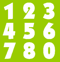 | ||||
Figures from ITC Kabel Ultra. | ||||||
